
Kikkoman USA
A refreshed website for a familiar brand
Client
Kikkoman
Category
Web design
Deliverables
Desktop and mobile site mockups
Optimized digital assets
Team
Karolina Lach | UI Designer
UX Designer
Art Director
Project Manager
Developer Team
About this project
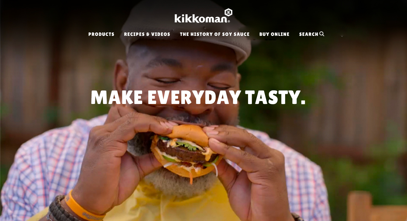
Kikkoman's North American website was in dire need of an update. The outdated design that greeted visitors made them question if they were in the right place; navigation was confusing, and content difficult to find.
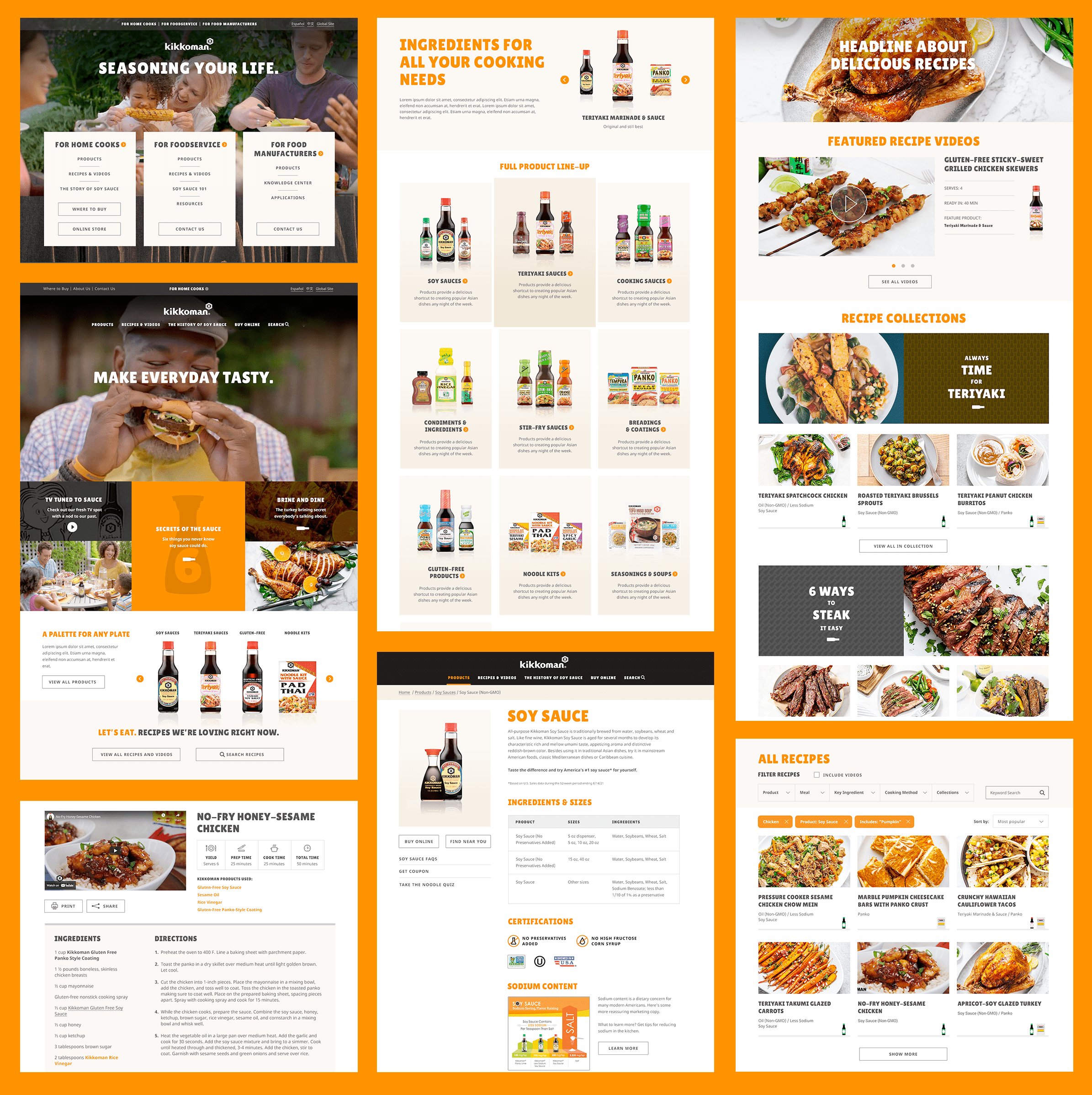
Extrapolating from the art director's approved design, I translated wireframed content into a modern, fun, welcoming portal for the brand. With improved search functionality and expanded showcase layout, it is now easier to both browse and find relevant recipes. Sections aimed at food industry and restaurant professionals received much-needed overhauls that reorganized and streamlined vital informational resources.
The redesigned site is now easy to navigate and reflects contemporary expectations of a major food brand.

Pages showing the revamped homepage, landing pages, and product and recipe navigation.

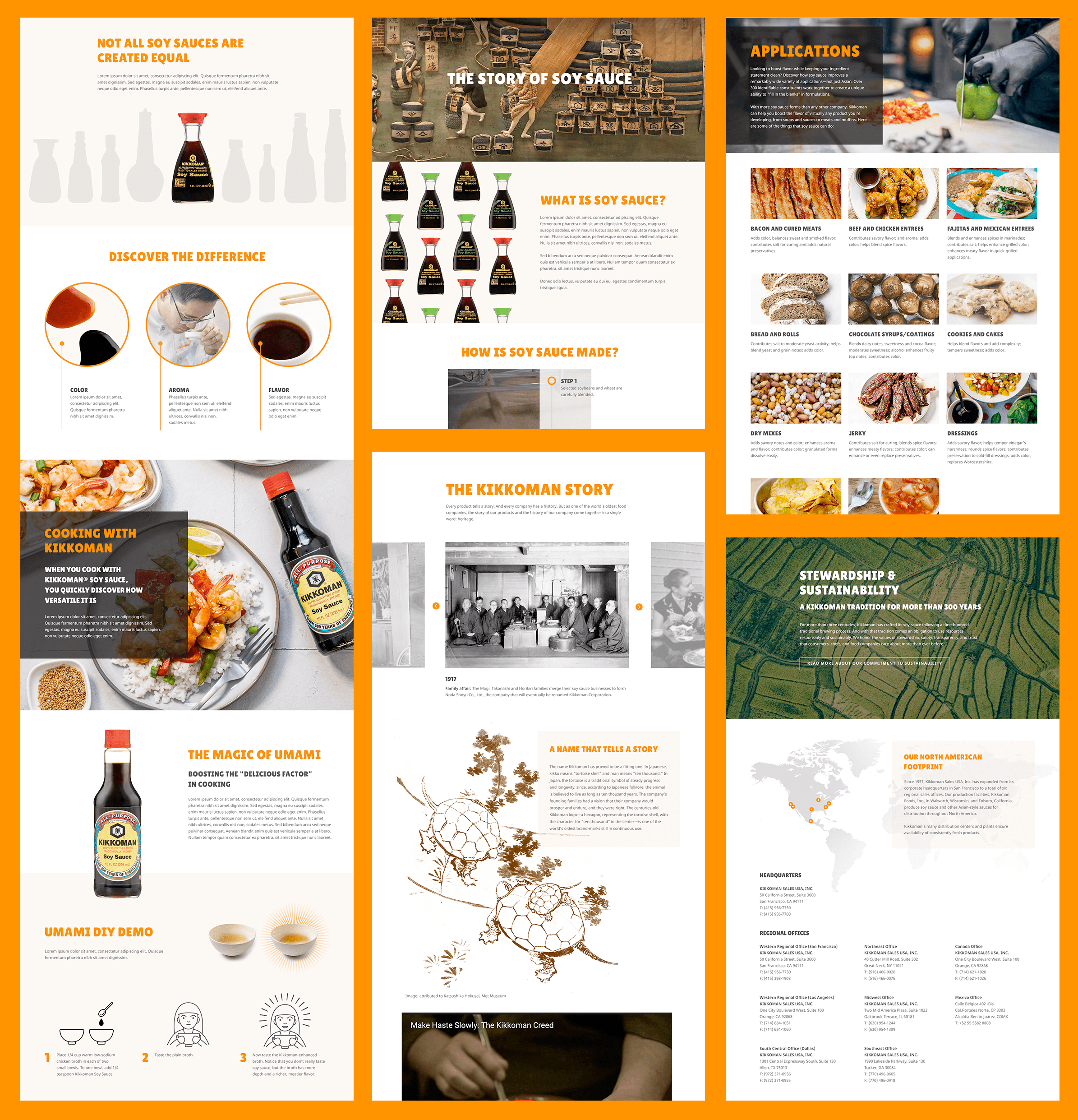
Pages showing the Story of Soy Sauce and other interesting but secondary information.